
O!Pack
Built the product architecture from scratch in an emerging Web3 space with few established precedents, translating complex asset flows into an experience everyday users could understand while navigating competing stakeholder interests.
🔒 This product is currently in development. Some details have been omitted for confidentiality and can be discussed further during an interview.

Multiple business units across the group manage their own digital assets, but these assets are fragmented across separate systems without a unified mechanism for custody, verification, or circulation. The product is positioned as shared asset infrastructure across business units, inspired by the role of a central securities depository in traditional financial markets.
Highlight 01
Turning Product Positioning into a Buildable 0→1 Architecture
Translated the product positioning into a buildable architecture spanning pages, fields, and states, while structuring open questions into a framework the team could align around as the product evolved.
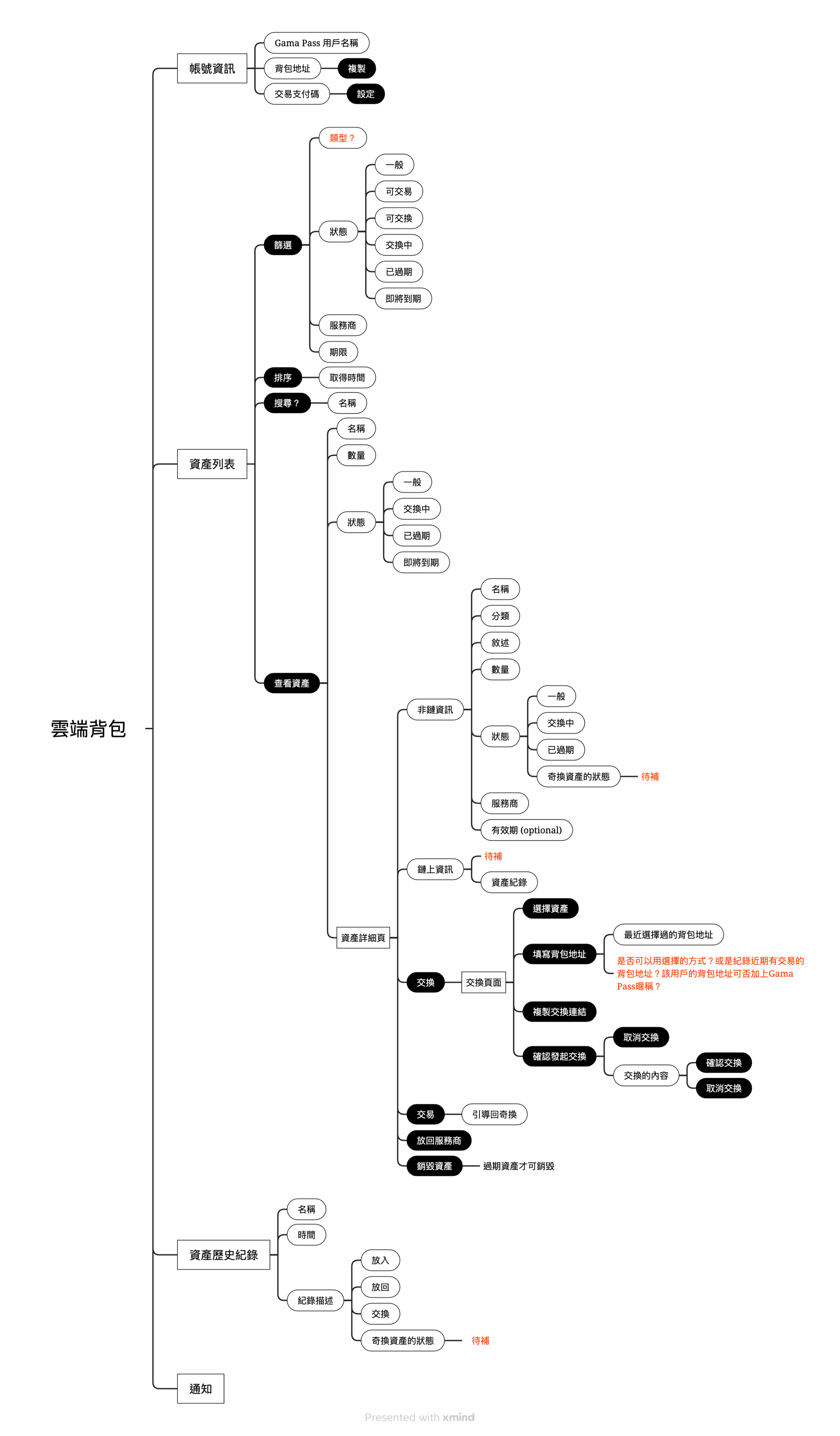
Turning Positioning into Architecture
With no existing system to build on, I started from the core product positioning and used XMind to map the full functional architecture, breaking core functional areas down into pages, fields, and states. Rather than leaving unresolved questions for later, I marked them directly in the architecture map. This turned the document into more than an information architecture artifact — it became a working tool for continuous team alignment as the product evolved.
Keeping Web2 Simple, While Preserving Web3 Verifiability
We wanted everyday users to complete core tasks without needing to understand blockchain concepts, while still giving more advanced users a way to verify asset authenticity. I therefore layered general asset information separately from on-chain data: Web2 users saw only what they needed to complete the task, while Web3 users could access additional on-chain information when they wanted to verify the asset. The goal was to keep the technology in the product’s foundation rather than making it a prerequisite for using the product.
Highlight 02
Redesigning Asset Flows Across Service Providers
Translated a Web3 asset flow that originally relied on wallet addresses into a transfer and exchange experience everyday users could understand. The design balanced usability with safeguards against fraud.
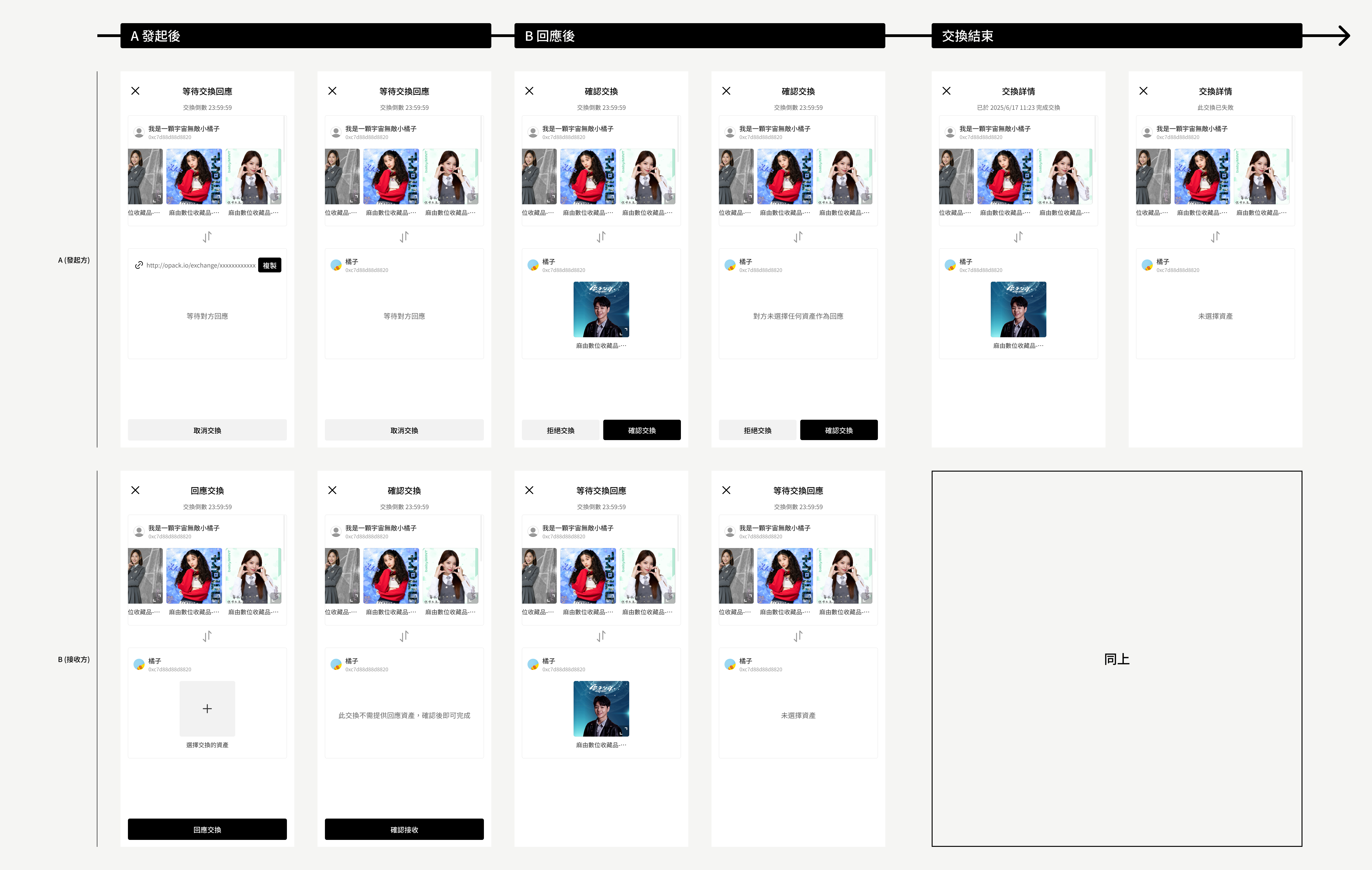
The First Barrier: Why Do I Need to Move Something I Already Own?
Users first had to move assets from other service providers into O!Pack before they could exchange them. For users unfamiliar with the underlying system, that created an immediate mental-model gap: “If this asset is already mine, why do I need to move it somewhere else first?” The transfer confirmation needed to do more than confirm an action. It had to establish the model first: explain what users could do after moving the asset in, allow them to defer the step, and provide clear feedback once the transfer was complete. This was the user’s first encounter with cross-system asset movement. If that moment created uncertainty, it could undermine trust in the exchange and selling flows that followed.
Rethinking Exchange Beyond Wallet Addresses
The original exchange flow relied on wallet addresses, but finding, understanding, and entering those addresses created unnecessary friction for everyday users. While mapping the flow, we explored a different interaction model: exchange by link. The initiator selects the asset they want to exchange, and the system generates a shareable link. The other party can open the link and enter the exchange flow directly, removing the need for both sides to find and enter each other’s wallet addresses beforehand. This not only shortened the flow, but also removed the concept of a wallet address from the core experience, making exchange feel closer to a familiar sharing interaction.
Not All Friction Should Be Removed
Past cases of users backing out of privately agreed exchanges had created fraud risks. PM raised the need for a safeguard, and after exploring several approaches, the team landed on a bilateral confirmation flow: Initiate exchange → Counterparty responds → Initiator confirms again → Exchange completed This reduced the risk of one-sided withdrawal, but every additional step also added cognitive load and another potential drop-off point. The real design question was not simply how to make the flow shorter, but: which friction should be removed — and which friction is there to protect the user?
Highlight 03
From Brand Trade-offs to a Scalable Identity
Framed three brand architecture options and their business trade-offs with another designer, giving leadership a clear basis for decision-making before translating the chosen direction into an extensible brand identity.
Brand Strategy Before Logo Design
As the product moved into execution, the first question was not what the logo should look like, but what role O!Pack should play within the group’s broader brand architecture. Together with another designer, I explored three brand architecture directions, referencing cases from Meta, Google Workspace, and Dropbox as part of the process: independent brand, prefixed brand, and co-branding. We compared their trade-offs across brand equity, go-to-market cost, partnership flexibility, and long-term independence.
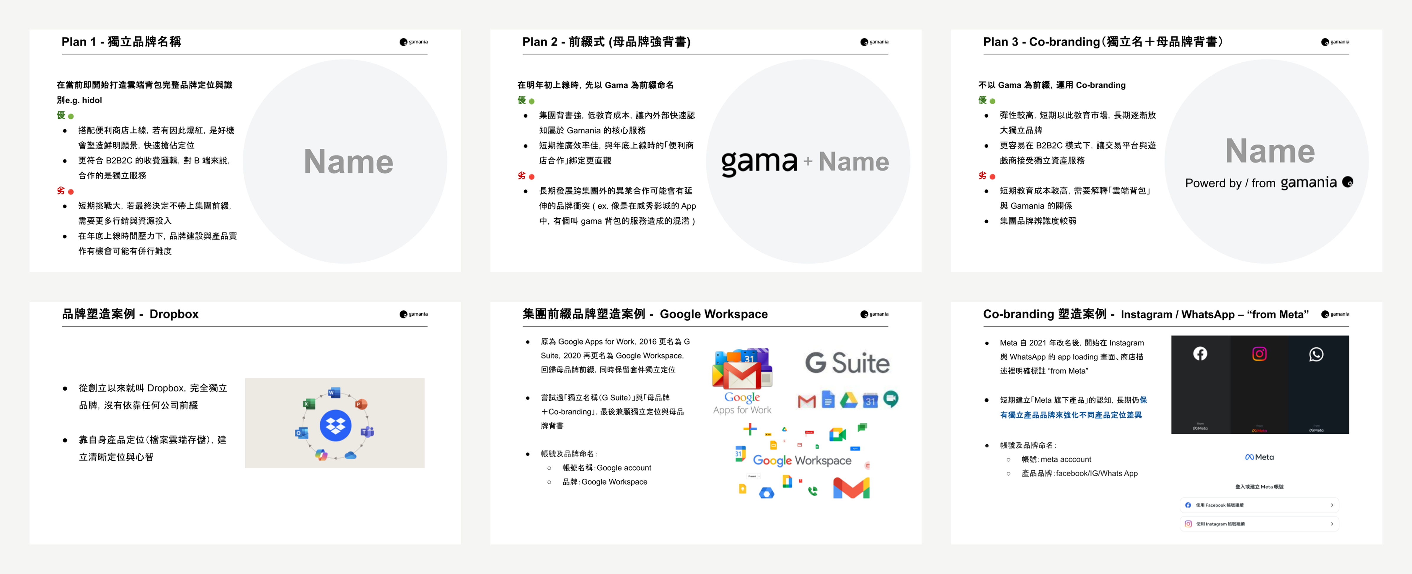
Design Framed the Trade-offs, Leadership Set the Strategy
Our initial preference was an independent brand with parent-brand endorsement, allowing the product to benefit from the group’s credibility early on while preserving room for long-term independence. The CEO ultimately decided that, at the product’s current stage, it was more important to leverage existing group brand equity and reduce the cost of building recognition. This led to the O! product family, positioned under Gama Pass. The decision was not simply about choosing a logo. It was a trade-off between brand equity, go-to-market cost, and long-term flexibility at different stages of the product.
Translating Strategy into a Visual System
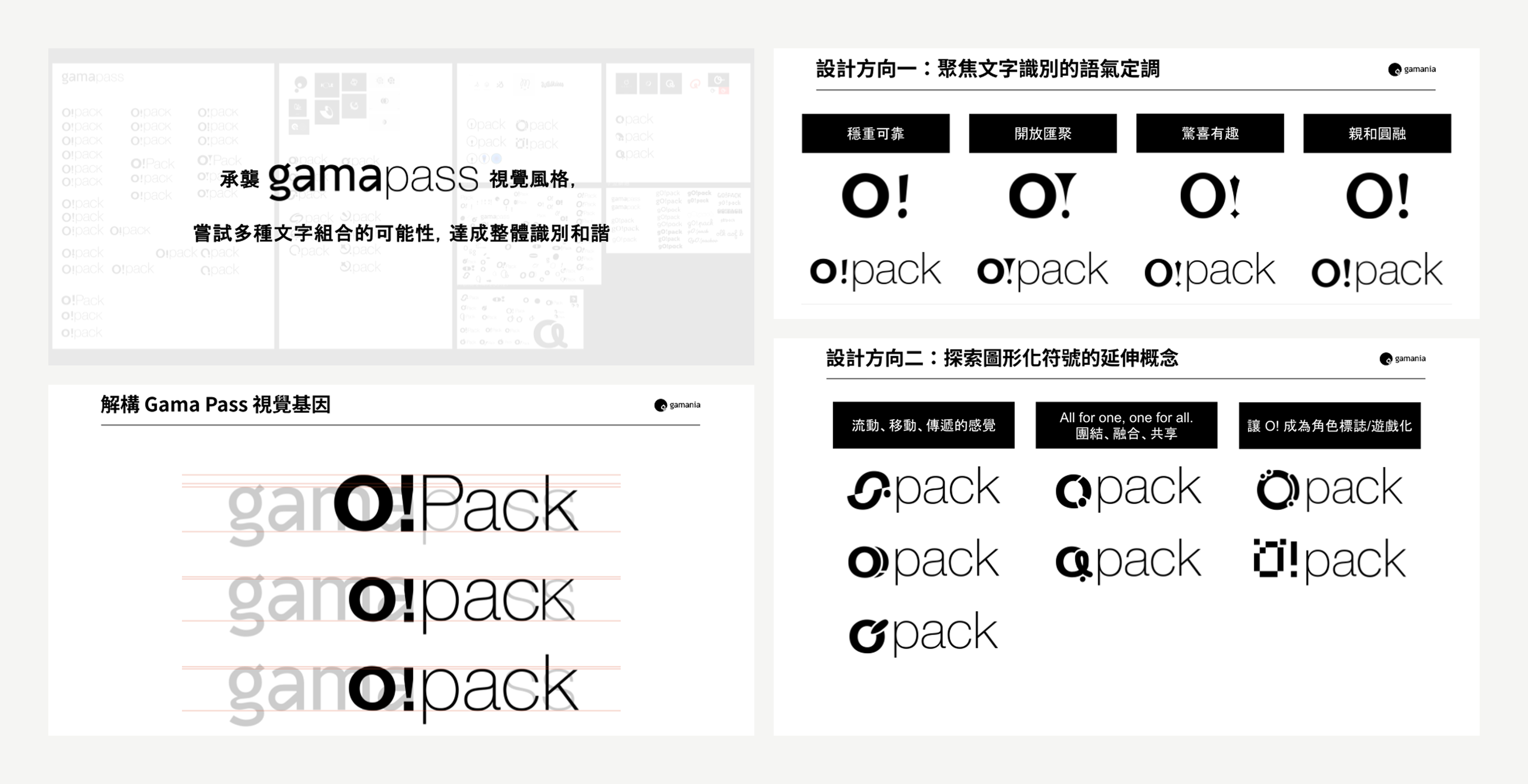
Once the direction was set, I translated the parent brand into a set of visual rules for O!Pack, including weight contrast between prefix and suffix, letter spacing, capitalization balance, and baseline relationships. This allowed O!Pack to inherit the recognizability of the parent brand while maintaining enough distinction and flexibility to grow as a sub-brand over time.
Other Contributions

Landscape Layout Optimization
Because the core user base includes gamers who may spend extended periods using the product in landscape orientation, I reviewed and adjusted the landscape layout to ensure that information hierarchy and key interactions remained usable across different screen ratios.
Results
- Positive Executive Feedback on the Brand DirectionThe proposed brand identity was well received by leadership, and the flexibility of the core visual system was recognized as a strength for future applications.
- The Architecture Map Became a Shared Working ToolOriginally created to structure the product from the ground up, the architecture map evolved into a working document shared across PM, design, and engineering as open questions were added and resolved. It helped the team align on feature scope and outstanding decisions while reducing information fragmentation across separate discussions.
The product is still in development, so there are no post-launch usage metrics to evaluate yet.
Retrospective
Balancing Competing Interests Has No Perfect Answer
Stakeholder priorities were not always fully aligned, and risk-control considerations added further constraints. Finding the right balance between necessary confirmation steps and a smooth experience remained an ongoing design challenge.
Navigating a New Domain from Scratch
Web3 was already an unfamiliar technical domain, and the lack of an existing system to build on added another layer of complexity. Unlike inheriting an established product, starting from scratch meant there were few precedents to rely on. Each architectural decision required us to establish our own rationale and decision framework as the product took shape.